Logo Showcase documentation
Set up, place and customize logo sliders, grids and tickers. For Free and Pro.
Overview
Everything you need to set up, place and customize logo sliders, grids and more. Version 5.0.0.
Logo Showcase turns a list of logos into a responsive slider or grid you can place anywhere on your site. You build each showcase in a dashboard with a live preview, then add it to a page with a block, an Elementor widget or a shortcode.
The plugin comes in two builds. The Free build is on WordPress.org. The Pro build is a separate download that contains everything in Free plus extra layouts and options. Throughout this guide, Free marks features in both builds and Pro marks features that need the Pro build. Use the switch at the top of the sidebar to hide the parts you don't need.
Free and Pro at a glance
| Feature | Free | Pro |
|---|---|---|
| Unlimited showcases and unlimited logos | ✓ | ✓ |
| Slider and Grid layouts | ✓ | ✓ |
| List, Ticker, Table, Filter grid and Sponsor tiers layouts | – | ✓ |
| Dashboard, editor and live preview (desktop, tablet, mobile) | ✓ | ✓ |
| Bulk upload and drag-and-drop reordering | ✓ | ✓ |
| Starter templates | 3 | 6 |
| Text direction: automatic, RTL or LTR | ✓ | ✓ |
| List layout options (logo position, 1 or 2 columns) | – | ✓ |
| Category filter position, shape and colors | – | ✓ |
| Block editor block, Elementor widget and shortcode | ✓ | ✓ |
| Titles, descriptions, tooltips and links (new tab, nofollow) | ✓ | ✓ |
| Card colors, border style and width, padding and corner radius | ✓ | ✓ |
| Slider autoplay, loop, drag and swipe, arrows, dots | ✓ | ✓ |
| Slider rows: 1 row | ✓ | Up to 4 |
| Slide time above 3 seconds, center mode | – | ✓ |
| Arrow position and shape, dot style and alignment | Basic | All |
| Logo effects (grayscale, blur) and hover effects (zoom out, lift up) | Zoom in only | ✓ |
| Tooltip positions bottom, left and right | Top only | ✓ |
| Category filter buttons | – | ✓ |
| Click-to-open popup | – | ✓ |
| Show-from and hide-after dates per logo | – | ✓ |
| Click counts per logo | – | ✓ |
| Google Fonts for titles | – | ✓ |
| Import and export through the REST API | – | ✓ |
| Custom CSS per showcase (administrators) | ✓ | ✓ |
| No jQuery, no slider library, assets loaded only where used | ✓ | ✓ |
Where to go next
Quick start
A working showcase on a page in five minutes.
Adding logos
Upload in bulk, reorder, add links and descriptions.
Layouts
Slider, grid and the Pro layouts explained.
Settings reference
Every option, its values and its default.
Showing a showcase
Block, Elementor, shortcode and PHP.
Troubleshooting
Fixes for the most common problems.
Requirements and installation
What your site needs and how to install either build.
Requirements
- WordPress 6.3 or newer (the admin uses the React that ships with WordPress).
- PHP 7.4 or newer. PHP 8.x is supported.
- A modern browser for the admin: current Chrome, Edge, Firefox or Safari.
- The WordPress REST API must be reachable for logged-in users. Some security plugins block it; see Troubleshooting.
Install the Free build Free
- Open the Plugins screenGo to Plugins → Add New Plugin and search for Logo Showcase.
- Install and activateClick Install Now, then Activate.
- Find the menuA new Logo Showcase item appears in the admin sidebar. Click it to open the dashboard.
You can also upload the zip: Plugins → Add New Plugin → Upload Plugin, choose the zip file, install and activate.
Install the Pro build Pro
The Pro build is a complete plugin, not an add-on. It replaces the Free plugin and keeps all your showcases.
- Download the Pro zipUse the download link in your purchase email or your account page.
- Upload itGo to Plugins → Add New Plugin → Upload Plugin and choose the Pro zip.
- Replace the Free pluginWordPress shows that the plugin is already installed. Click Replace current with uploaded. If you prefer, deactivate and delete the Free plugin first. Your showcases are stored in the database, so they are not lost.
- ActivateActivate the plugin and enter your license key if you are asked for one. The dashboard shows a Pro badge when the Pro features are unlocked.
Both builds use the same folder name. Install one at a time and use Replace current with uploaded to switch.
Updating
Update from the Plugins screen as usual. Back up your site first when moving between major versions. The Free build updates from WordPress.org; the Pro build updates from your account.
Who can use it
| Action | Capability needed |
|---|---|
| See the Logo Showcase menu and dashboard | edit_posts (Author and above) |
| Create, edit and delete a showcase | The normal edit and delete rights for that showcase |
| Upload images from the editor | upload_files |
| Global settings and Custom CSS | manage_options (Administrator) |
Quick start
Build a showcase and put it on a page.
- Create a showcaseOpen Logo Showcase in the admin menu and click New showcase, or pick a starter template. You land in the editor.
- Name itType a name at the top left, for example Homepage clients. Visitors don't see this name; it helps you find the showcase and is used as the accessible label.
- Add logosIn the Logos tab click Add logos to choose images from the Media Library, or Upload files to upload many images at once. You can also drag image files straight onto the panel.
- Check the previewThe live preview on the right updates as you work. Use Desktop, Tablet and Mobile to check each size.
- Adjust the lookUse the tabs on the left: Layout, Style, Slider (or Grid), Tooltips, Links and Advanced.
- SaveClick Save changes (or press Ctrl+S / ⌘+S). Make sure the status at the top says Published.
- Place itClick Copy next to the shortcode at the top, then paste it into a page. Or use the Logo Showcase block or the Elementor widget. See Showing a showcase.
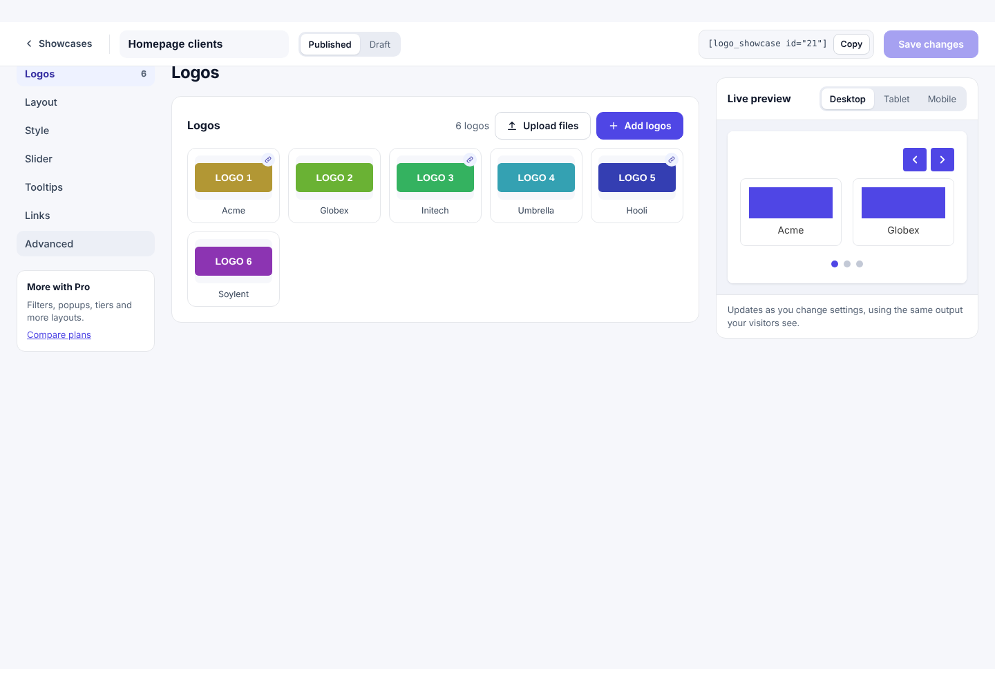
The dashboard
Your list of showcases, starter templates and shortcuts.
Open Logo Showcase in the admin menu. The top bar has four pages: Showcases, Templates, Settings and Help. The New showcase button is always at the top right.
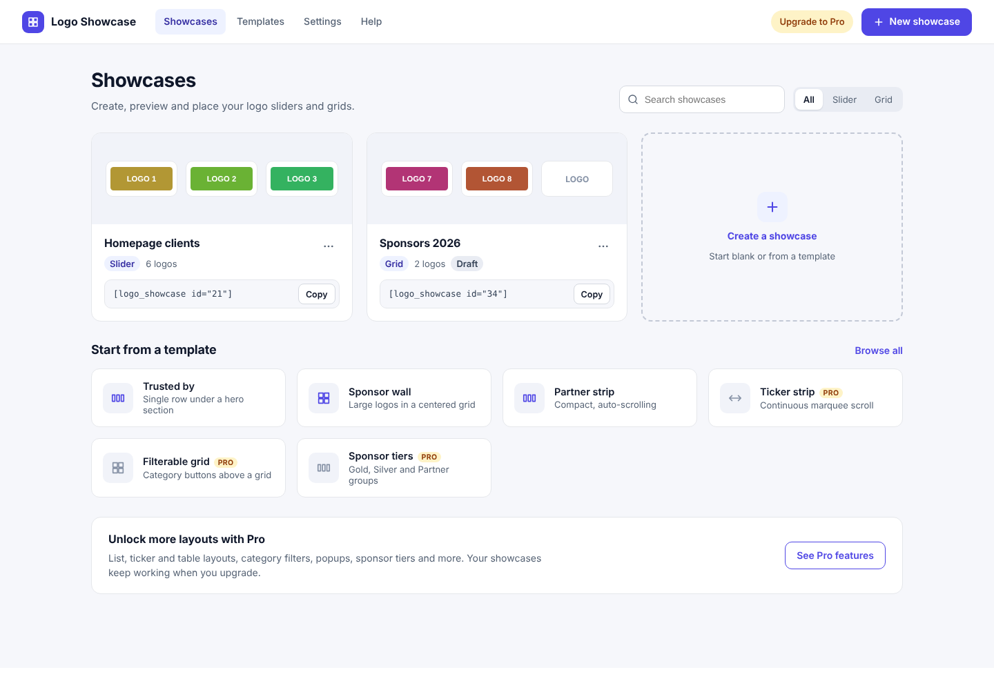
Showcase cards
- Search filters the cards by name as you type.
- Layout filter (All, Slider, Grid and others) narrows the list by layout.
- Copy copies the shortcode, for example
[logo_showcase id="21"]. - The ⋯ menu on each card has Edit, Duplicate, Publish / Unpublish and Delete.
- A Draft badge means the showcase is unpublished and hidden from visitors.
Duplicate, unpublish and delete
- Duplicate makes a copy named "… (copy)" with the same settings and logos. It is the quickest way to make a variation.
- Unpublish turns the showcase into a draft. Pages that use its shortcode show nothing to visitors. Logged-in editors see a hidden note in the page source.
- Delete moves the showcase to the WordPress trash after you confirm. Pages that use its shortcode stop showing it. You can restore it from the trash.
Starter templates
The templates section lets you start with a ready-made look. See Templates.
The editor
A tour of the screen where you build a showcase.
The top bar
- ‹ Showcases returns to the dashboard. If you have unsaved changes you are asked to confirm.
- Name of the showcase.
- Published / Draft switch. Drafts are hidden from visitors.
- Unsaved changes appears when something has changed since the last save. The browser also warns you if you try to close the tab.
- Shortcode with a Copy button.
- Save changes saves everything. Shortcut: Ctrl+S on Windows and Linux, ⌘+S on Mac.
The left tabs
Each tab groups related settings. Some tabs only appear for the layout they belong to.
| Tab | What is in it | Shown for |
|---|---|---|
| Logos | Add, upload, reorder and edit logos | All layouts |
| Layout | Layout, text direction, order, maximum logos, list style and category filter options | All layouts |
| Ticker Pro | Direction, speed, rows and columns | Ticker |
| Style | Card colors, borders, effects, titles and descriptions | All layouts |
| Slider | Movement, size, arrows and dots | Slider |
| Grid | Columns and spacing | Grid, Filter grid |
| Tooltips | Hover label settings | All layouts |
| Links | Where logo links open, nofollow | All layouts |
| Advanced | Custom CSS, lazy loading, image size | All layouts |
| Pro options Pro | Popup, click counts, Google Font, filter and tier text | All layouts (Pro build) |
When you change the layout the tabs change with it. Choosing Ticker hides the Slider tab and shows the Ticker tab.
Live preview
The preview on the right is rendered by the same code visitors see, inside a frame. It updates a moment after every change, including logo titles, descriptions and links. Use Desktop, Tablet and Mobile to see how it behaves at each width. The device buttons also switch which screen size the "per screen size" settings edit.
Right-to-left sites
Set Layout → Text direction to Automatic (follow site language), Right to left (RTL) or Left to right (LTR). Automatic follows the language of the current page, so it works on Arabic, Hebrew, Persian and Urdu sites, including multilingual sites. In RTL the slider starts from the right, the arrows swap sides, dragging and Next/Previous follow the new direction, and text alignment is mirrored.
Settings that depend on other settings
Options that don't apply are hidden. For example the arrow color only appears while Show arrows is on, and the delay only appears while Autoplay is on.
Locked Pro options
In the Free build, Pro options show a Pro label. Clicking one shows a message instead of changing the setting. Values that need Pro are never saved in the Free build.
Adding and managing logos
Upload, order and describe the logos in a showcase. There is no limit on how many you can add.
Three ways to add logos
- Add logos opens the WordPress Media Library. Select as many images as you like and click Add to showcase.
- Upload files opens your computer's file picker. Choose several images; they upload to the Media Library and are added in one go.
- Drag and drop. Drag image files from your computer onto the Logos panel. The panel highlights when you can drop.
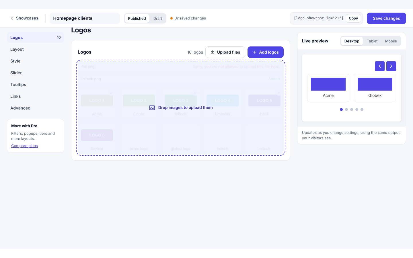
Up to three files upload at the same time. If one file fails (for example a file type your site doesn't allow), the rest still upload and the failed file shows its error. Only image files are accepted. New logos get their file name as the title, which you can change.
Logos are added to the editor but not saved until you click Save changes.
Reordering
Drag a card to a new position, or select a card and use the ‹ and › buttons. Dropping a card in the empty space after the last card moves it to the end. If Order is set to Random or A to Z, your manual order is still saved but the visitor sees the other order.
Editing one logo
Click a logo card to open Edit logo below the list.
| Field | Use | Plan |
|---|---|---|
| Title | Shown under the logo (if Show logo titles is on), used in the tooltip, and used as the alt text when no alt text is set. | Free |
| Link URL | Where the logo goes when clicked. Must start with http:// or https://. Leave empty for no link. | Free |
| Alt text | Text for screen readers and when the image can't load. If empty, the image's own alt text from the Media Library is used, then the title. | Free |
| Description | A short text about the company. Shown under the title when Show logo descriptions is on (Style tab), in the Pro List and Table layouts, and in the Pro popup. Plain text only; HTML tags are removed. | Free |
| Categories | Appears when the layout is Filter grid. Groups logos under filter buttons. See Filter grid. | Pro |
| Tier | The group name for the Sponsor tiers layout, for example Gold. | Pro |
| Show from / Hide after | Dates between which the logo is visible. See Scheduling. | Pro |
Use Replace image to swap the picture and keep its title, link and description. Use Remove to take the logo out of this showcase (the image stays in your Media Library).
Image tips
- Use transparent PNG or SVG-style logos with similar proportions for the neatest result.
- Upload each logo at about twice the size it will display, so it stays sharp on high-density screens.
- Pick the loaded size under Advanced → Image size. See Advanced.
- SVG uploads need to be enabled on your site by a security-aware plugin, because WordPress blocks them by default.
Choosing a layout
Open the Layout tab and click a layout card. Pro layouts show a Pro label in the Free build.
| Layout | Best for | Plan |
|---|---|---|
| Slider | A single row (or a few rows) that moves by itself or with arrows, dots, drag and swipe. "Trusted by" strips. | Free |
| Grid | A static wall of logos in columns. Sponsor pages, partner lists. | Free |
| List | One logo per line with its name and description beside it. | Pro |
| Ticker | A continuous, smooth marquee, sideways or up and down, with several rows. | Pro |
| Table | A neat table with logo, name and description columns. | Pro |
| Filter grid | A grid with category buttons so visitors can narrow the logos. | Pro |
| Sponsor tiers | Logos grouped under headings such as Gold, Silver and Partner. | Pro |
Switching layout never deletes logos. Settings for the layout you leave are kept, so you can switch back.
Slider Free
Logos sit in a row and move automatically or on demand.
- Autoplay moves the slider on a timer. A pause button appears so visitors can stop it. Visitors who set their device to reduce motion don't get autoplay.
- Loop keeps moving forever. Turn it off to stop at the first and last logo.
- Logos visible at once is set separately for desktop, tablet and mobile.
- Pro Rows stacks logos inside each slide, 1 to 4 rows. With 2 rows, each slide holds two logos on top of each other. The Free build shows a single row.
- Drag and swipe: with a mouse, press and drag the logos sideways; on a touch screen, swipe. The logos follow your finger or pointer and snap to the nearest slide when you let go. Dragging a little (less than about a fifth of a logo) springs back.
- Arrows and dots are in the same Slider tab. Arrows can be set to appear only on hover.
- Keyboard: arrows, dots and the pause button are buttons you can reach with Tab.
- If there are no more logos than fit on screen, the slider doesn't move and hides its arrows.
- Pro Center mode highlights the middle logo and dims the others. Use an odd number of visible logos.
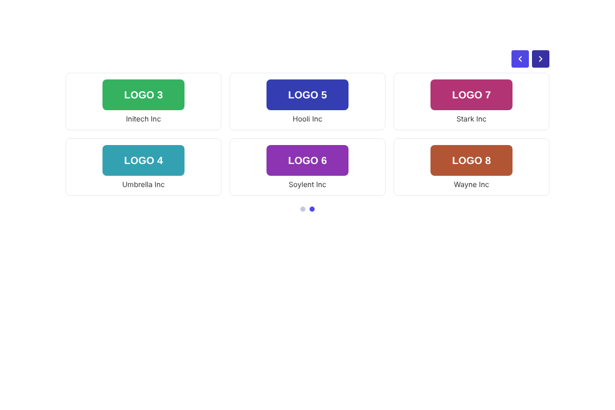
Grid Free
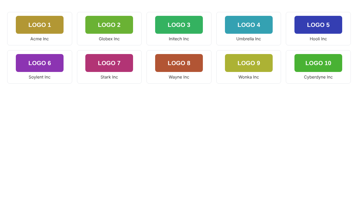
Logos fill a grid of equal columns. Set the number of columns per screen size and the gap between logos in the Grid tab.
List Pro
Each logo has its own row with the logo card, the title in bold and the description. The description is always shown in this layout; the Show logo descriptions switch isn't needed.
In the Layout tab, List style → Logo position chooses: Logo left (logo, then text), Logo right (text, then logo) or Logo center (logo on top with the text centered below). In right-to-left sites left and right are mirrored.
Columns (same group) shows the list in 1 column or 2 columns. Two columns automatically become one on screens narrower than 678px.
Table Pro
A real HTML table with the columns Logo, Name and About. Good for accessibility and for long partner lists.
Ticker Pro
A continuous marquee. Choose Ticker in the Layout tab, then open the Ticker tab.
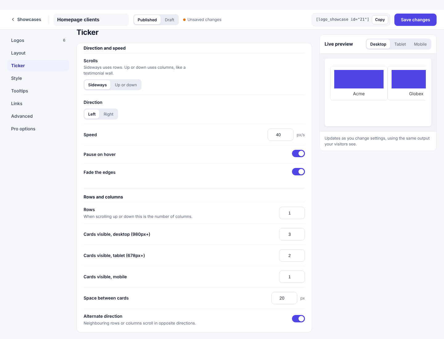
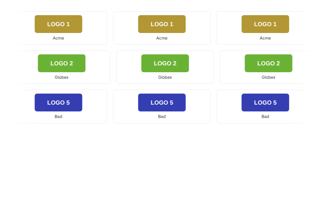
- Scrolls: Sideways makes rows that move left or right. Up or down makes columns that move vertically, like a testimonial wall. In that mode set a Height.
- Speed is in pixels per second, so the ticker moves at the same speed whatever the number of logos.
- Rows is the number of rows. When scrolling up or down it is the number of columns. Logos are shared out between the rows one by one.
- Cards visible (sideways only) decides how wide each card is: 3 on desktop 980px and wider, 2 on tablet 678px and wider and 1 on mobile by default.
- Alternate direction makes neighbouring rows or columns move in opposite directions.
- Pause on hover stops it while the pointer is over it. Fade the edges softens the start and end.
- If a row has too few logos to fill the width, the ticker repeats them so there is never a gap.
- Visitors who reduce motion get a static, scrollable strip instead of animation.
Filter grid Pro
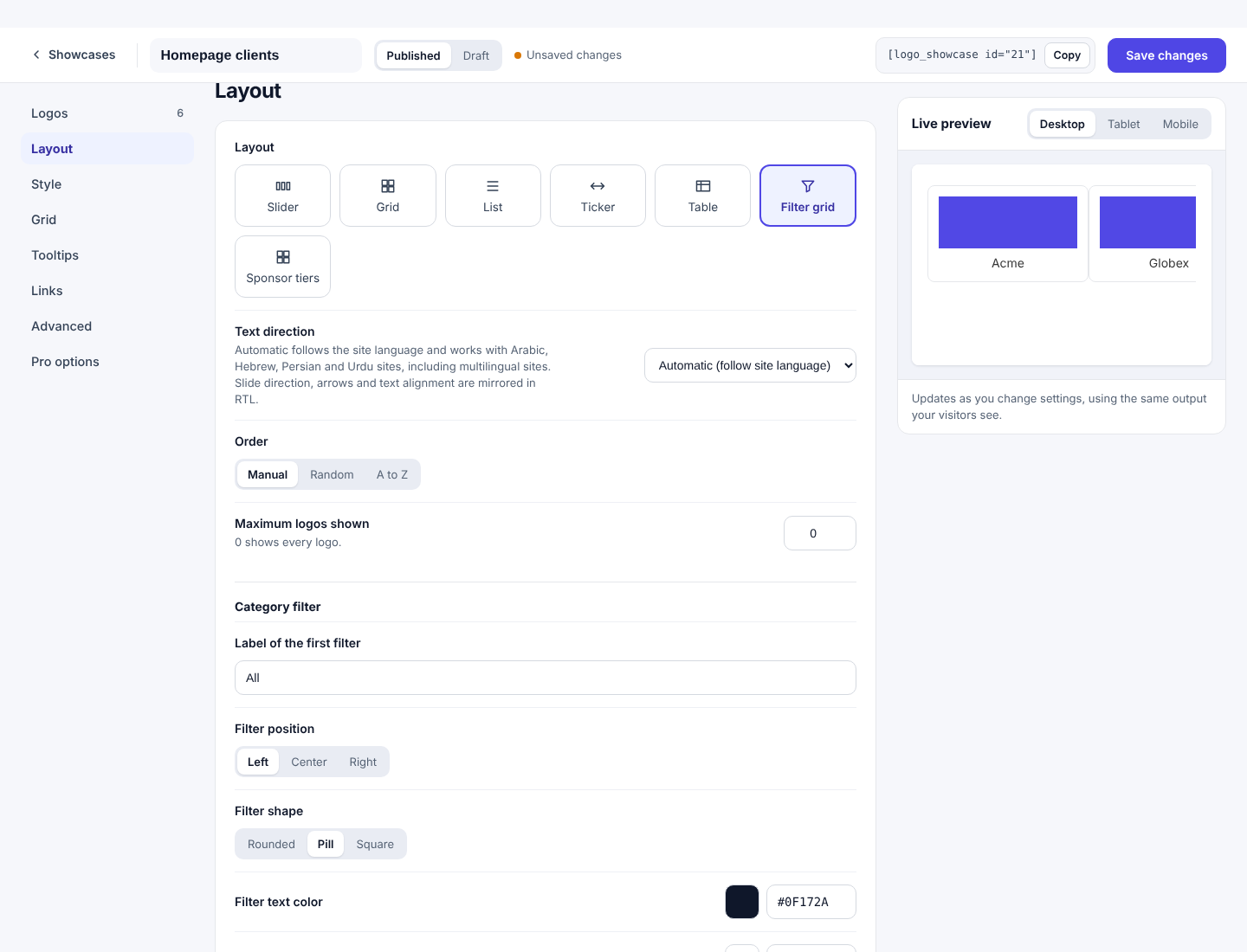
A grid with a row of buttons above it. Visitors click a category to see only the logos in it.
- Choose the layoutIn the Layout tab pick Filter grid.
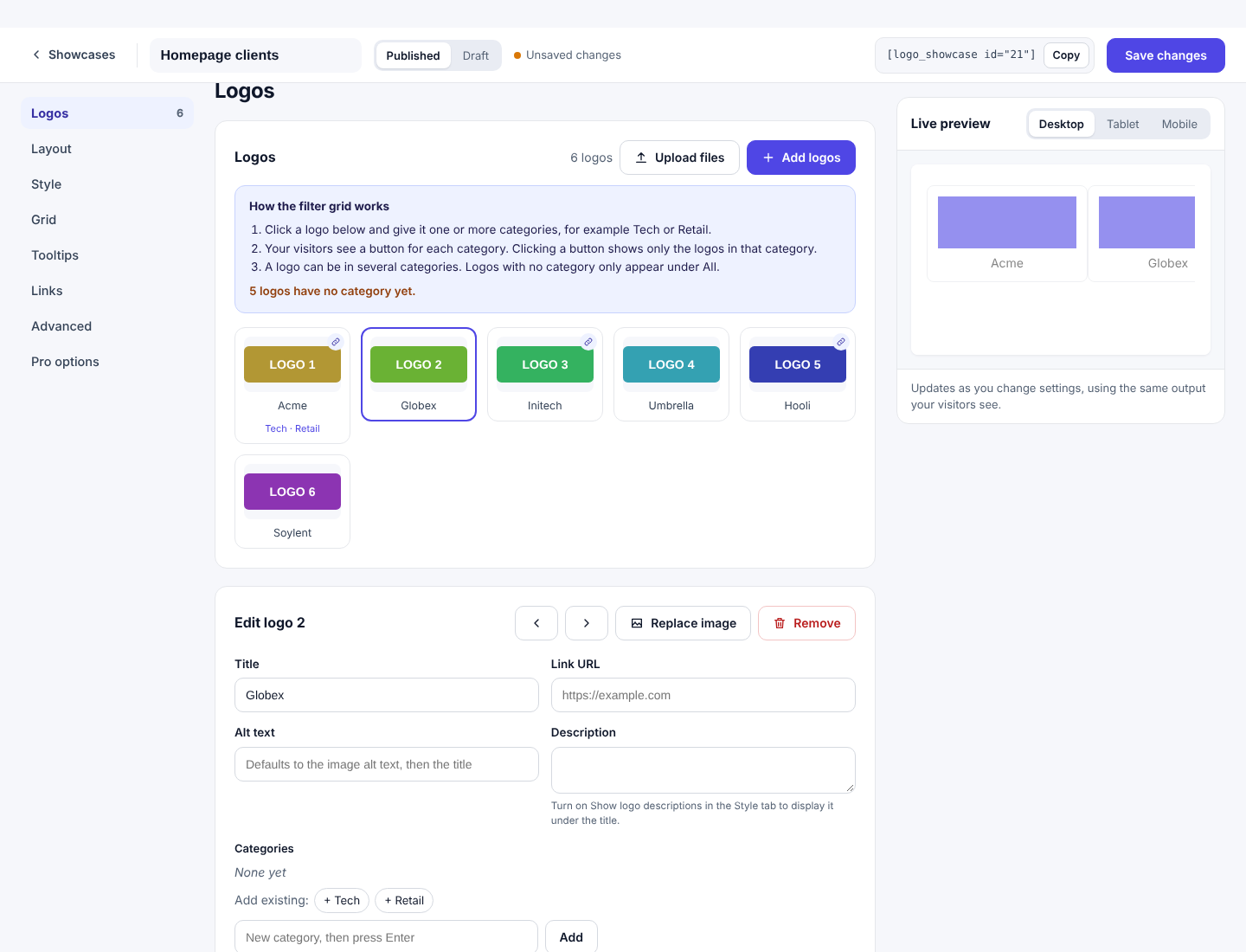
- Open the Logos tabA blue help box explains the filter and tells you how many logos still have no category.
- Give each logo categoriesClick a logo. In the Categories box type a name such as Tech and press Enter. Or click an existing category under Add existing. Click a selected category to remove it.
- Check the previewButtons appear for each category, plus an All button.
- A logo can be in several categories and then shows under each of them.
- Logos with no category only show under All.
- If no logo has a category, no buttons are shown and it looks like a normal grid.
- In the Layout tab, the Category filter group sets: Label of the first filter (default All), Filter position (Left, Center, Right), Filter shape (Rounded, Pill, Square), and the colors: text, background, active text and active background (the active color is also the button border).
- Columns and gap come from the Grid tab.
- Category names are matched ignoring upper and lower case and spaces. Retail and retail are the same category.
Sponsor tiers Pro
Groups logos under headings, highest tier first. Set the tier names in Pro options → Tier names, separated by commas, for example Gold, Silver, Partner. Then give each logo a Tier with the same name in its edit box. Logos with no tier, or a tier that isn't in the list of names, are placed in the last group or in a group of their own. Empty tiers are not shown. Columns and gap come from the Grid tab.
Settings reference
Every option in the editor, what it does, the values it accepts and its default. These tables are generated from the plugin itself.
The Plan column tells you whether an option is in Free, needs Pro, or is free with some values reserved for Pro (shown as yellow chips in Values). In the Free build, picking a Pro value shows a message and the value is not saved.
Layout tab
Choose the layout, the order of logos and how many to show.
| Setting | What it does | Values | Default | Plan |
|---|---|---|---|---|
| Layout | How the logos are arranged. Slider and Grid are free. List, Ticker, Table, Filter grid and Sponsor tiers are Pro. | SliderGridListTickerTableFilter gridSponsor tiers | slider | Free + Pro values |
| Text direction | Automatic (follow site language)Right to left (RTL)Left to right (LTR) | Automatic (follow site language) | Free | |
| Order | Manual keeps the order you dragged them into. Random shuffles on every page load. A to Z sorts by title. | ManualRandomA to Z | Manual | Free |
| Maximum logos shown | Show only the first N logos after ordering. 0 shows all logos. | 0 to 1000 | 0 | Free |
| Category filter | ||||
| Label of the first filter | Text of the button that shows every logo in the Filter grid. Shown for the filter layout. | Text | All | Pro |
| List style | ||||
| Columns | Shown for the list layout. | 1 column2 columns | 1 column | Pro |
| Logo position | Shown for the list layout. | Logo leftLogo rightLogo center | Logo left | Pro |
| Filter position | Shown for the filter layout. | LeftCenterRight | Left | Pro |
| Filter shape | Shown for the filter layout. | RoundedPillSquare | Pill | Pro |
| Filter text color | Shown for the filter layout. | Any color | #0f172a | Pro |
| Filter background color | Shown for the filter layout. | Any color | #ffffff | Pro |
| Active filter text color | Shown for the filter layout. | Any color | #ffffff | Pro |
| Active filter and button background color | Shown for the filter layout. | Any color | #4f46e5 | Pro |
Style tab
How each logo card looks. Applies to every layout.
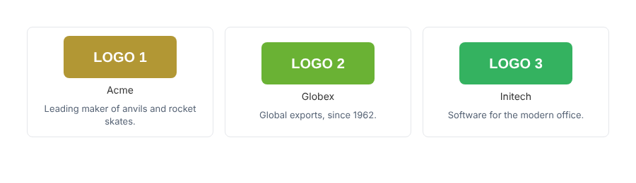
Titles and descriptions each have their own group of options inside this tab. Descriptions are hidden by default: turn on Show logo descriptions to display the description you wrote for each logo.
| Setting | What it does | Values | Default | Plan |
|---|---|---|---|---|
| Card background | Background of each logo card. | Any color | #ffffff | Free |
| Card background on hover | Card background while the pointer is over it. | Any color | #ffffff | Free |
| Border width | Thickness of the card border. 0 removes the border. | 0 to 20 px | 1 px | Free |
| Border style | SolidDashedDottedDoubleNone | Solid | Free | |
| Border color | Card border color. | Any color | #e5e7eb | Free |
| Border color on hover | Card border color on hover. | Any color | #c7d2fe | Free |
| Card padding | Space between the card edge and the logo. | 0 to 80 px | 12 px | Free |
| Corner radius | Roundness of the card corners. | 0 to 80 px | 8 px | Free |
| Logo effect | Filter applied to the logo image. The normal colors return when the visitor hovers over the card. | NormalGrayscaleBlurBlur and grayscale | Normal | Free + Pro values |
| Hover animation | Animation when the visitor hovers over a card. Zoom in is free; Zoom out and Lift up are Pro. | NoneZoom inZoom outLift up | None | Free + Pro values |
| Show logo titles | Show each logo's title under the image. The title also feeds the tooltip and the image alt text fallback. | On / Off | On | Free |
| Title alignment | Left, center or right aligned title. Shown when Show logo titles is on. | LeftCenterRight | Center | Free |
| Title size | Title font size. Shown when Show logo titles is on. | 8 to 48 px | 14 px | Free |
| Title style | Normal or italic title text. Shown when Show logo titles is on. | NormalItalic | Normal | Free |
| Title color | Title text color. Shown when Show logo titles is on. | Any color | #333333 | Free |
| Show logo descriptions | Show each logo's description under its title. Logos without a description are skipped. | On / Off | Off | Free |
| Description alignment | Left, center or right aligned description. Shown when Show logo descriptions is on. | LeftCenterRight | Center | Free |
| Description size | Description font size. Shown when Show logo descriptions is on. | 8 to 36 px | 13 px | Free |
| Description style | Normal or italic description text. Shown when Show logo descriptions is on. | NormalItalic | Normal | Free |
| Description color | Description text color. Shown when Show logo descriptions is on. | Any color | #556274 | Free |
Slider tab
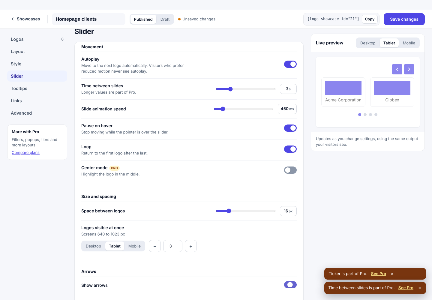
Movement, size, arrows and dots. Only shown for the Slider layout.
Arrows and dots used to be a separate tab. They are now groups named Arrows and Dots inside this tab.
| Setting | What it does | Values | Default | Plan |
|---|---|---|---|---|
| Movement | ||||
| Autoplay | Moves to the next logos automatically. Visitors who ask their device to reduce motion do not get autoplay. A pause button is shown whenever autoplay is on. | On / Off | On | Free |
| Time between slides | Seconds each slide stays before moving on. Free is limited to 3 seconds; Pro allows up to 10. Shown when Autoplay is on. | 1 to 10 s Pro above 3 s | 3 s | Free + Pro values |
| Slide animation speed | How long the slide animation takes, in milliseconds. | 100 to 3000 ms | 450 ms | Free |
| Pause on hover | Stops autoplay while the pointer is over the slider. Shown when Autoplay is on. | On / Off | On | Free |
| Loop | Return to the first logo after the last. Off makes the slider stop at the ends. | On / Off | On | Free |
| Center mode | Highlights the logo in the middle of the visible group and dims the others. Works best with an odd number of visible logos. | On / Off | Off | Pro |
| Size and spacing | ||||
| Space between logos | Space between logos in the slider. | 0 to 80 px | 16 px | Free |
| Logos visible at once desktop / tablet / mobile | How many logos are visible at once on each screen size. Desktop is 1024px and wider, tablet is 640 to 1023px, mobile is below 640px. | 1 to 10 | 4 / 3 / 2 | Free |
| Rows | Stack logos in rows inside each slide. 1 shows a single row; 2 shows two logos on top of each other per slide. | 1 to 4 Pro above 1 | 1 | Free + Pro values |
| Arrows | ||||
| Show arrows | Previous and next arrow buttons. | On / Off | On | Free |
| Show arrows only on hover | Arrows fade in when the pointer is over the slider or a button has keyboard focus. Touch screens always show them. Shown when Show arrows is on. | On / Off | Off | Free |
| Arrow position | Where the arrows sit. Top right is free; Top left and Centered are Pro. Shown when Show arrows is on. | Top rightTop leftCentered | Top right | Free + Pro values |
| Arrow shape | Square or round arrow buttons. Round is Pro. Shown when Show arrows is on. | SquareRound | Square | Free + Pro values |
| Arrow color | Arrow icon color. Shown when Show arrows is on. | Any color | #ffffff | Free |
| Arrow background | Arrow button background. Shown when Show arrows is on. | Any color | #4f46e5 | Free |
| Arrow hover background | Arrow button background on hover. Shown when Show arrows is on. | Any color | #3730a3 | Free |
| Dots | ||||
| Show dots | Dot buttons for jumping to a slide. | On / Off | On | Free |
| Dot style | Round, square or line dots. Round is free. Shown when Show dots is on. | RoundSquareLine | Round | Free + Pro values |
| Dot alignment | Left, center or right aligned dots. Center is free. Shown when Show dots is on. | LeftCenterRight | Center | Free + Pro values |
| Dot color | Color of inactive dots. Shown when Show dots is on. | Any color | #c3c9d6 | Free |
| Active dot color | Color of the current dot. Shown when Show dots is on. | Any color | #4f46e5 | Free |
Grid tab
Columns and spacing. Shown for the Grid and Filter grid layouts.
| Setting | What it does | Values | Default | Plan |
|---|---|---|---|---|
| Columns desktop / tablet / mobile | Number of columns on each screen size. Desktop is 1024px and wider, tablet is 640 to 1023px, mobile is below 640px. | 1 to 10 | 4 / 3 / 2 | Free |
| Space between logos | Space between grid items. In Sponsor tiers and Filter grid it also spaces the logos. | 0 to 80 px | 16 px | Free |
Ticker tab
Only shown for the Ticker layout.
| Setting | What it does | Values | Default | Plan |
|---|---|---|---|---|
| Direction and speed | ||||
| Scrolls | Sideways uses rows. Up or down uses columns, like a testimonial wall. | SidewaysUp or down | Sideways | Pro |
| Direction | Which way sideways rows move. Shown when Scrolls is Sideways. | LeftRight | Left | Pro |
| Direction | Which way vertical columns move. Shown when Scrolls is Up or down. | UpDown | Up | Pro |
| Speed | How fast the ticker moves, in pixels per second. | 5 to 400 px/s | 40 px/s | Pro |
| Pause on hover | Pause the ticker while the pointer is over it. | On / Off | On | Pro |
| Fade the edges | Fade the logos out at the edges of the ticker. | On / Off | On | Pro |
| Rows and columns | ||||
| Rows | Number of rows. When scrolling up or down this is the number of columns. | 1 to 6 | 1 | Pro |
| Cards visible, desktop (980px+) | How many cards fit across the ticker. Desktop 980px and wider, tablet 678px and wider, mobile below that. Shown when Scrolls is Sideways. | 1 to 12 | 3 | Pro |
| Cards visible, tablet (678px+) | How many cards fit across the ticker. Desktop 980px and wider, tablet 678px and wider, mobile below that. Shown when Scrolls is Sideways. | 1 to 12 | 2 | Pro |
| Cards visible, mobile | How many cards fit across the ticker. Desktop 980px and wider, tablet 678px and wider, mobile below that. Shown when Scrolls is Sideways. | 1 to 12 | 1 | Pro |
| Space between cards | Space between cards, and between rows or columns. | 0 to 80 px | 20 px | Pro |
| Height | Height of the ticker when it scrolls up or down. Shown when Scrolls is Up or down. | 160 to 1200 px | 400 px | Pro |
| Alternate direction | Neighbouring rows or columns scroll in opposite directions. | On / Off | On | Pro |
Tooltips tab
The small label that appears over a logo on hover or keyboard focus.
A tooltip shows the logo title. A logo with no title has no tooltip. In a slider, Left and Right tooltips of the first and last visible logo can be clipped by the slider edge; use Top or Bottom there.
| Setting | What it does | Values | Default | Plan |
|---|---|---|---|---|
| Show tooltip on hover | A small label with the logo title appears when the visitor hovers or focuses a card. | On / Off | On | Free |
| Position | Where the label appears. Top is free; Bottom, Left and Right are Pro. Shown when Show tooltip on hover is on. | TopBottomLeftRight | Top | Free + Pro values |
| Text color | Tooltip text color. Shown when Show tooltip on hover is on. | Any color | #ffffff | Free |
| Background | Tooltip background color. Shown when Show tooltip on hover is on. | Any color | #1f2937 | Free |
Links tab
What happens when a visitor clicks a logo that has a link.
| Setting | What it does | Values | Default | Plan |
|---|---|---|---|---|
| Open links in | Open logo links in the same tab or a new tab. New-tab links also get rel="noopener". | Same tabNew tab | Same tab | Free |
| Add rel="nofollow" | Adds rel="nofollow" to logo links, which tells search engines not to pass ranking credit. Use it for sponsor links. | On / Off | Off | Free |
Advanced tab
Custom CSS, image loading and size.
| Setting | What it does | Values | Default | Plan |
|---|---|---|---|---|
| Custom CSS | Extra CSS for this showcase only. Only administrators can edit it. See Custom CSS for selectors. | CSS | empty | Free |
| Lazy-load images | Loads logo images only when they are close to the screen. Leave on unless a logo flashes in. | On / Off | On | Free |
| Image size | Which WordPress image size to load. Medium is a good balance; use Full only for large, sharp logos. | ThumbnailMediumLargeFull | Medium | Free |
Pro options tab
Features that only exist in the Pro build.
| Setting | What it does | Values | Default | Plan |
|---|---|---|---|---|
| Open a popup on click | Clicking a logo opens a popup with the image, title, description and a Visit website button instead of going straight to the link. | On / Off | Off | Pro |
| Count clicks | Counts clicks on each logo. Totals are stored per showcase and logo; no personal data is saved. | On / Off | Off | Pro |
| Google Font for titles | A Google Fonts family name for titles and descriptions, for example Poppins. The font loads from Google when set. Leave empty to use your theme font. | Text | empty | Pro |
| Tier names | Tier headings for the Sponsor tiers layout, highest first, separated by commas. A logo goes under the tier with the same name. Shown for the tiers layout. | Text | Platinum, Gold, Silver | Pro |
Templates
Start from a ready-made look instead of a blank showcase.
On the dashboard, the Templates page lists starter designs. Click one to create a new showcase with its layout and style already set, then add your own logos.
| Template | What you get | Plan |
|---|---|---|
| Clean slider | A simple autoplay slider with plain cards | Free |
| Grayscale grid | A grid of muted logos that gain color on hover | Free |
| Cards grid | A grid of bordered cards with titles | Free |
| Ticker strip | A one-row continuous marquee | Pro |
| Filterable grid | A grid with category buttons | Pro |
| Sponsor tiers | Gold, Silver and Partner groups | Pro |
A template only sets options. It never adds logos, and you can change any option afterwards.
Showing a showcase
Four ways to put a published showcase on your site.
1. Block editor Free
- Add the blockIn a page or post click + and search for Logo Showcase.
- Pick a showcaseChoose it from the drop-down. The block shows a live preview in the editor.
- UpdatePublish or update the page.
2. Shortcode Free
Paste the shortcode into a Shortcode block, a classic editor, a widget area or any page builder text field:
[logo_showcase id="21"]The ID is shown on the dashboard card and in the editor top bar. Use the Copy button so you don't mistype it. Older shortcodes from version 4 keep working.
3. Elementor widget Free
With Elementor active, search the widget panel for Logo Showcase, drag it onto the page and choose the showcase in the widget's Showcase control.
4. In a theme template (PHP) Free
<?php echo do_shortcode( '[logo_showcase id="21"]' ); ?>Assets load only where needed
The plugin's CSS and JavaScript are added only to pages that contain a showcase, and none of it depends on jQuery or a slider library. If your theme prints a showcase inside content loaded later (for example a popup), the assets are still output with the showcase.
Unpublished and empty showcases
A draft or deleted showcase shows nothing to visitors. A showcase with no logos shows nothing to visitors, and shows a short hint to editors.
Pro features
These options live in the Pro options tab, in the logo editor and in the layout settings. They require the Pro build.
Click-to-open popup
Turn on Open a popup on click (Pro options). Clicking a logo opens an accessible dialog with the large logo, title, description and a Visit website button if the logo has a link. It closes with the Esc key, the close button or a click outside, and focus returns to the logo.
Scheduling logos
In a logo's edit box set Show from and Hide after. Outside those dates the logo is not output. Dates use your site's time zone (Settings → General). Use it for sponsors with a contract period or seasonal campaigns.
Click counts
Turn on Count clicks to record clicks on logos that have a link. The count is stored with the logo. Counts are anonymous: no visitor data is stored.
Click counts are recorded, but this version has no screen that displays them. Developers can read them from the REST API (see Developer reference).
Google Fonts
Choose a font in Pro options → Google Font for titles. The font is added to the page only where that showcase is used. Because fonts load from Google, add a note to your privacy policy if your visitors' region requires it. Leave it empty to use your theme font.
Import and export
The Pro build can export a showcase (settings and logo list) as JSON and import it to another site through the REST API. There is no button in the dashboard in this version. Images are referenced by URL, so run the import on a site that has the same Media Library files or re-attach them.
Pro-only options inside other tabs
- Layout: List, Ticker, Table, Filter grid and Sponsor tiers, plus the List style and Category filter groups.
- Slider: slide time up to 3 seconds is Free; longer delays, 2 to 4 rows, center mode, all arrow positions and shapes, dot styles.
- Style: grayscale and blur logo effects, hover zoom out and lift up.
- Tooltips: bottom, left and right positions.
See the Settings reference for the exact values.
Global settings
Settings that apply to all showcases. Administrators only.
Open Logo Showcase → Settings on the dashboard. Here you can change the default look new showcases start with, and see whether Pro is active. Per-showcase options always win over the defaults.
- Defaults only affect showcases created after you change them.
- Uninstalling the plugin leaves your showcases in the database so nothing is lost if you reinstall.
Upgrading from version 4
Your existing showcases keep working.
- Old showcases and shortcodes are read as they are. Nothing is changed in the database until you open a showcase in the new editor and save it.
- The first time you open an old showcase the settings are converted in memory. Check the preview before saving.
- Border style, list style (position and columns), text direction and category filter options from version 4 are all available again.
- Version 5 does not use jQuery or the old slider library, so a few rarely used v4 options have no equivalent. The preview shows exactly what visitors will see.
- If you wrote custom CSS against the old class names, review it. New class names start with
lsw-. - Take a backup before upgrading. Rolling back to version 4 is possible because the old data is not removed.
Accessibility and performance
What is built in and what you should do.
Accessibility
- Sliders are labelled regions. Arrows, dots and the pause button are real buttons reachable by keyboard.
- Tooltips show on keyboard focus as well as hover.
- Autoplay and ticker animation are turned off for visitors who prefer reduced motion.
- Always write alt text or a title for each logo. Logos without any text are announced as "image".
- The popup is a modal dialog that traps focus and returns it when closed.
Performance and layout shift
- No jQuery and no external slider library. The slider script is small and loads only where used.
- The space for the showcase is reserved by the CSS before the script runs, so the page doesn't jump (zero layout shift).
- Images are lazy-loaded by default. Turn lazy loading off for a showcase at the very top of the page.
- Pick the smallest image size that stays sharp (Advanced → Image size).
- Caching plugins are fine. Showcases are plain HTML. If you exclude scripts from optimization, exclude
frontend.jsonly if you see problems.
Troubleshooting
Solutions to the most common problems.
The editor shows an error or stays blank
The editor talks to the WordPress REST API. Open yoursite.com/wp-json/ in a new tab while logged in. If it shows an error, a security or caching plugin or the server is blocking it. Allow the logo-showcase/v1 route, then reload. Also check that your PHP version is 7.4 or newer and WordPress 6.3 or newer.
The showcase doesn't appear on the page
Check that the status is Published, that the shortcode ID matches, and that the showcase has logos. Clear your caching plugin and browser cache.
The live preview doesn't change
The preview updates a moment after each change. If it shows an error message, read it: it usually means the REST API is blocked. Reload the editor and try again.
The slider doesn't move
Autoplay may be off, the slider may have no more logos than are visible at once, or the visitor's device may be set to reduce motion. Increase the number of logos or reduce Logos visible.
Dragging logos with the mouse doesn't work
Dragging works on sliders with more logos than fit on screen. Press and hold on the logo area, not on a link only. A very short drag springs back by design.
I can't see descriptions
Turn on Style → Show logo descriptions, and make sure the logo has a description.
Filter buttons don't appear
The layout must be Filter grid (Pro) and at least one logo must have a category.
A tooltip is cut off at the edge
Left and right tooltips on the first or last logo can be clipped by the slider's edge. Use Top or Bottom.
Uploading fails
The file may be too big (see Media → Add New for the limit), not an image type, or you may lack the upload_files capability. Other files in the same batch are not affected.
A Pro option shows a lock
You are running the Free build or Pro is not active. See installation.
My theme's CSS changes the look
Add rules in Advanced → Custom CSS and start them with the showcase wrapper class. See the Developer reference.
Frequently asked questions
Is there a limit on logos or showcases?
No. Both builds allow unlimited showcases and unlimited logos.
Will I lose my showcases if I switch from Free to Pro?
No. They are stored in the database and Pro reads them.
What happens if my Pro license expires?
Your showcases keep displaying. Pro-only settings are treated as unavailable and fall back to their Free equivalents until Pro is active again.
Can I use more than one showcase on a page?
Yes. Add as many as you like; each has its own settings.
Does it work with page builders?
Yes. Use the shortcode anywhere, or the Elementor widget.
Does it work with caching and CDN plugins?
Yes. Output is static HTML plus a small script.
Does it track visitors?
No. The only optional recording is the Pro anonymous click count per logo.
Developer reference
For theme and plugin developers.
Wrapper and class names
| Class | Element |
|---|---|
.lsw | Outer wrapper of every showcase. Also has .lsw-layout-slider, -grid, etc. |
.lsw-item | One logo card |
.lsw-title, .lsw-desc | Title and description |
.lsw-nav, .lsw-dots | Arrows and dots |
.lsw-tip | Tooltip |
Use your browser inspector on a live showcase to see the exact structure and the per-showcase CSS variables (they start with --lsw-).
Custom CSS example
.lsw .lsw-item { box-shadow: 0 2px 8px rgba(0,0,0,.08); }
.lsw .lsw-title { letter-spacing: .02em; }
PHP filters
| Filter | Use |
|---|---|
lsw_is_pro | Whether Pro features are active |
lsw_item_after_title | Add HTML after a logo's title |
JavaScript event
Dispatch lsw:update on a showcase wrapper to make its slider recalculate (for example after showing a hidden tab):
document.querySelector('.lsw').dispatchEvent(new Event('lsw:update'));REST API
Namespace logo-showcase/v1. All routes need a logged-in user with the right capability and the REST nonce, except the Pro click beacon.
| Route | Purpose |
|---|---|
GET /meta | Schema of every option, layouts and templates |
GET/POST /showcases | List and create |
GET/POST/DELETE /showcases/{id} | Read, update, delete one |
POST /preview | Rendered HTML for the live preview |
POST /track Pro | Click beacon |
GET /export/{id}, POST /import Pro | Move showcases between sites |
Changelog
5.0.0
- New React dashboard and editor with a live preview.
- Dependency-free slider and grid; no jQuery; zero layout shift.
- Bulk upload and drag-and-drop ordering; unlimited logos.
- Slider rows (Pro), arrows on hover, mouse drag, center mode (Pro).
- Logo descriptions.
- Border style, text direction (automatic, RTL, LTR), list position options and category filter styling.
- Block editor block and Elementor widget.
- Pro: list, ticker, table, filter grid and sponsor tiers layouts; popup; scheduling; click counts; Google Fonts; image and hover effects.