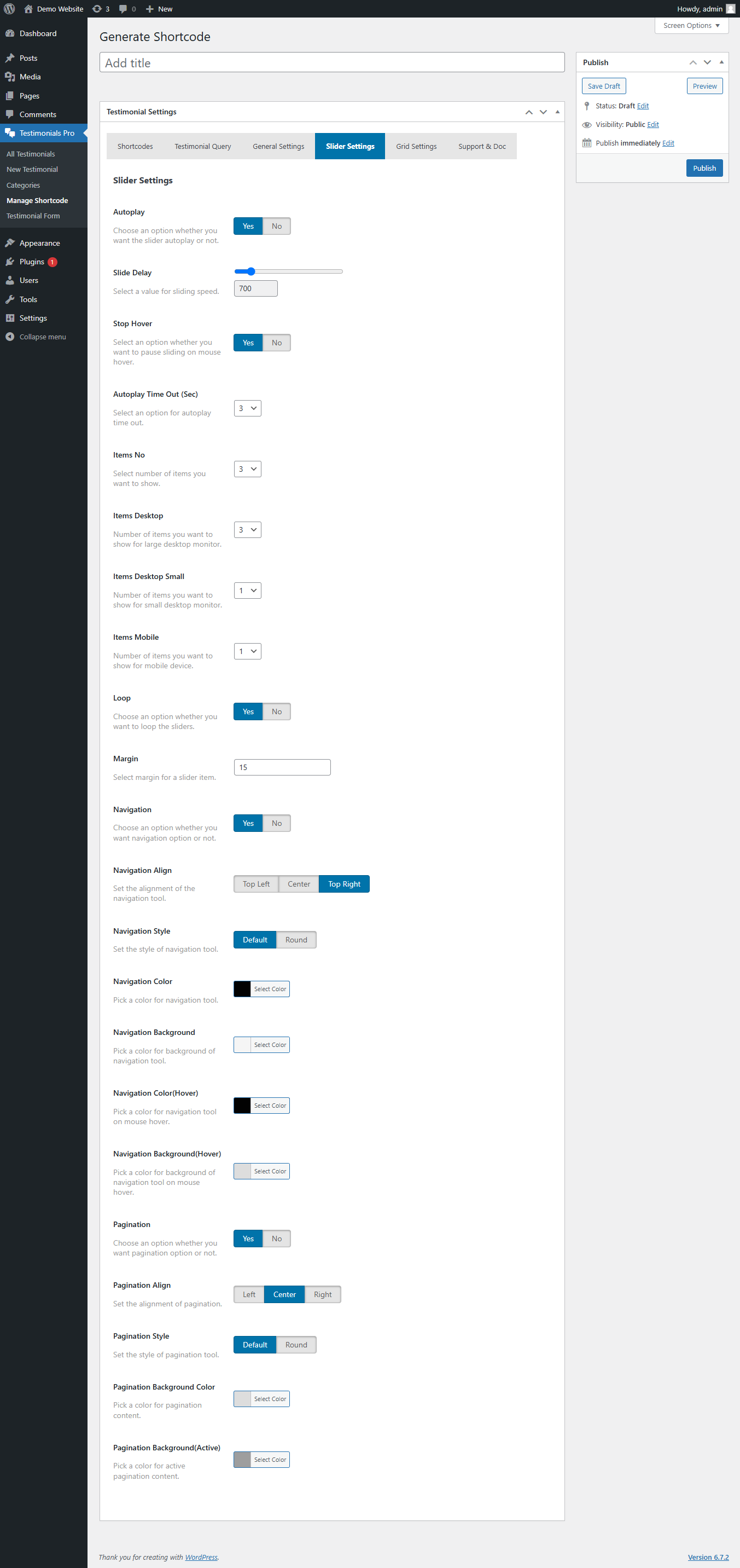
The Slider Settings section in Super Testimonial Pro allows you to control the behavior and appearance of testimonial sliders. Below is a detailed explanation of each option available.

1. Autoplay Settings
1.1 Autoplay
- Enable or disable automatic sliding of testimonials.
- Options:
- Yes – The slider will move automatically.
- No – Users must manually navigate testimonials.
1.2 Slide Delay
- Set the duration (in milliseconds) between each slide transition.
- Example: 3000ms (3 seconds) for a smooth user experience.
1.3 Stop Hover
- Pause the slider when the user hovers over a testimonial.
- Options:
- Yes – The slider stops when hovered.
- No – The slider continues even on hover.
1.4 Autoplay Timeout (Seconds)
- Define the time interval before restarting the slider after the last transition.
2. Number of Items
2.1 Items No
- Set how many testimonials will be displayed per slide.
2.2 Items for Different Devices
- Items Desktop – Number of testimonials shown on large screens (e.g., 1920px+).
- Items Desktop Small – Number of testimonials shown on smaller desktops (e.g., 1366px+).
- Items Mobile – Number of testimonials shown on mobile screens (e.g., 480px+).
3. Loop & Margin
3.1 Loop
- Enable or disable infinite looping of the slider.
- Options:
- Yes – The slider restarts from the first slide after the last one.
- No – The slider stops at the last testimonial.
3.2 Margin
- Set spacing between each testimonial slide.
- Example: 10px margin for better spacing.
4. Navigation Controls
4.1 Navigation (Arrows)
- Enable or disable next/previous arrows for manual control.
- Options:
- Yes – Navigation arrows will be shown.
- No – Navigation arrows will be hidden.
4.2 Navigation Align
- Choose where to position the navigation arrows.
- Available options:
- Top Left
- Center
- Top Right
4.3 Navigation Style
- Select the style of navigation buttons.
- Available options:
- Default – Standard navigation design.
- Round – Circular navigation buttons.
4.4 Navigation Color
- Choose a color for navigation arrows.
4.5 Navigation Background
- Pick a background color for the navigation buttons.
4.6 Navigation Color (Hover)
- Set the hover color for the navigation buttons.
4.7 Navigation Background (Hover)
- Choose the hover background color for the navigation buttons.
5. Pagination (Dots)
5.1 Pagination
- Enable or disable pagination dots below the slider.
- Options:
- Yes – Dots will be displayed for navigation.
- No – Pagination will be hidden.
5.2 Pagination Align
- Choose where to position the pagination dots.
- Available options:
- Left
- Center
- Right
5.3 Pagination Style
- Select a pagination style.
- Available options:
- Default – Standard dot style.
- Round – Rounded pagination dots.
5.4 Pagination Background Color
- Set the background color of pagination dots.
5.5 Pagination Background (Active)
- Choose a color for the active pagination dot.